Some projects you finish and move on. Aurum Wall Decor is the one we still show first.
The client came to us with a product that was genuinely remarkable — ultra-thin, flexible natural stone panels. Marble. Travertine. Onyx. Stone that bends. Sourced from quarries across India and the Mediterranean, precision-cut to 1–2mm, laminated with a proprietary flexible composite so it could wrap around curved walls, columns, furniture surfaces. A material innovation that most people in India had never seen.
They had no logo. No brand name typography. No website. No photographs. No digital presence at all.
We built everything. This is exactly how — every decision, every tool, every reason.
Why “Luxury” Had to Mean Something Specific
The brief word was “luxury.” Every second client says luxury. Most of them mean “make it dark with gold text.”
We spent the first week trying to understand what luxury actually meant for this product specifically. Stone that bends isn’t a mass-market product. It’s for architects, interior designers, high-end contractors, homeowners doing statement walls and feature ceilings. The purchase decision happens slowly, visually, tactilely. Nobody buys flexible stone panels without seeing them first.
That completely changed how we approached the website. This wasn’t an e-commerce store. It was a digital showroom. The job of every page was to make someone feel the material through a screen — and then pick up the phone.
That insight shaped everything: the typography scale, the animation pace, the photography treatment, the copy voice, the navigation structure. Before we opened Figma, we had a clear brief: the website should feel like walking into a Milan showroom, not scrolling through an Indian product catalogue.
Building the Brand Identity: Logo, Colour, Type
The Logo
The circular monogram — the gold “A” with the “Aurum Wall Decor” ring — went through four rounds before we got there.
Round one: a geometric stacked logotype, clean and modern. Client reaction: looks like a tech company. Right feedback.
Round two: a serif wordmark alone. Felt incomplete on its own — nothing to anchor it visually across circular brand applications (product stamps, embossed materials, packaging).
Round three: a circular seal with the full name and a central letterform. Closer. But the letterform was too mechanical.
Round four: the current version. The “A” designed with a subtle calligraphic lift at the top — a nod to handcraft and material provenance without becoming a script logo. The circular ring creating a seal-like authority. The “Aurum Wall Decor” lettering spaced out in tracked uppercase to breathe inside the circle.
It works at 16px as a favicon. It works embossed on a stone panel sample. It works large in the navigation. That’s the test for a mark that has to live across physical and digital surfaces.
Colour System
| Role | Value | Reasoning |
|---|---|---|
| Primary gold accent | #c9a84c | Warm gold — references the material, signals premium without being gaudy |
| Background | #faf7f2 | Off-white cream — softer than pure white, evokes stone surface, warm not clinical |
| Primary text | Deep forest green / charcoal | Grounds the warmth, creates legibility without harsh black-on-cream |
| Decorative lines | Gold at low opacity | Geometric SVG patterns that signal craft without cluttering |
The critical decision here: no black backgrounds. Every luxury brand in this space defaults to black-and-gold. Aurum’s product is about natural warmth — marble veining, travertine texture, onyx translucency. Black backgrounds would have fought the material. The cream background lets the product photography breathe and feel true.
Typography
Cormorant Garamond for all display headings — weights 300 through 500. This is not a casual choice. Cormorant is one of the few Google Fonts that carries genuine editorial luxury without looking like a wedding invitation. The hairline serifs at large sizes echo the thinness of the stone panels themselves. The ‘AURUM’ wordmark in the hero, set at display scale in Cormorant, looks like it belongs in Architectural Digest.
Montserrat for UI elements and navigation — clean, modern, widely legible. Paired with Cormorant, it creates the classic luxury pairing: expressive display type grounded by a functional sans.
The Website: Every Major Decision
Stack Choice
Astro for the frontend, deployed on Cloudflare Pages. This was the right choice for three specific reasons:
- The site is content-stable — collections don’t change weekly. Static generation with Astro means every page is pre-rendered HTML. No server round trips, no JavaScript-heavy hydration on load.
- Cloudflare Pages gives global CDN delivery from the edge. For a luxury brand targeting architects across India, loading in under 1 second on a Delhi connection and a Mumbai connection and a Bangalore connection matters equally.
- GSAP animations work cleanly in Astro’s island architecture — we could scope all animation logic to the pages that needed it without bloating the base bundle.
Contact form submissions go through a Google Apps Script Web App endpoint — serverless, free, no infrastructure to maintain. Combined with Cloudflare Turnstile for CAPTCHA (lighter and less hostile than reCAPTCHA), the form handles real leads without a backend.
The Hero Section
The homepage hero for a luxury stone brand cannot be a standard image-left/text-right layout. That’s a brochure website.
We built a floating cluster hero: four stone panel photographs arranged at slight rotations around the central AURUM wordmark. No carousel. No autoplay. Just the brand name, large in Cormorant Garamond, with “WHERE STONE BECOMES SOMETHING UNEXPECTED” tracked out underneath in small caps.
The stone images in the cluster are actual installation photography — panels on walls, wrapped around columns, installed behind media units. This is the right visual proof: not the product in isolation but the product doing its job in a real space.
Below the hero: a single CTA button — “EXPLORE COLLECTIONS.” One action. Not three CTAs fighting for attention.
Smooth Scroll and Animation
We used Lenis for smooth scroll — it replaces the browser’s native scroll with a physics-based easing that makes the whole page feel intentional and unhurried. This is the single detail most visitors notice without being able to name it. The page just moves differently from a standard website.
GSAP handles all reveal animations: text lines that slide up on entry, section transitions that fade in as the viewport reaches them, the preloader sequence (gold accent lines drawing in before the hero reveals). Every animation has a reduced-motion fallback — we don’t penalise users who have that preference enabled.
The preloader is worth calling out specifically. First-time visitors see a brief gold-accent animation before the page loads. This is stored in session storage — return visits skip it entirely. It’s a theatrical entrance that signals premium before a single product image loads, without sacrificing speed for repeat visitors.
Collections Page
17 stone collections. Each with its own character: Satvario’s rich veining, the prismatic translucency of the Blue collection, the warmth of Golden Copper, the drama of Dark Grey Marble.
The grid uses a full-bleed hero image behind the “Collections” heading — a macro photograph of soft stone contours that feels more like textile than rock. Underneath, the collection cards are clean and editorial: full-width stone photograph, stone name, nothing else. The product speaks. The page doesn’t.
A custom visual dropdown on the contact form lets visitors select their stone of interest using thumbnail photographs — not a text dropdown. This is a detail that costs an extra afternoon of development and produces a materially better experience for the specific audience (people who chose this product visually, who will always prefer to see before they select).
Contact Page
The “Request Sample” CTA in the navigation was a deliberate positioning choice. Not “Contact Us.” Not “Get a Quote.”
“Request Sample” — because the correct first step for this product is physical. You need to hold a 1mm-thin piece of marble to understand it. The CTA frames the conversion as a low-commitment material request, not a sales meeting. That’s the right entry point for the audience.
What the Live Site Looks Like
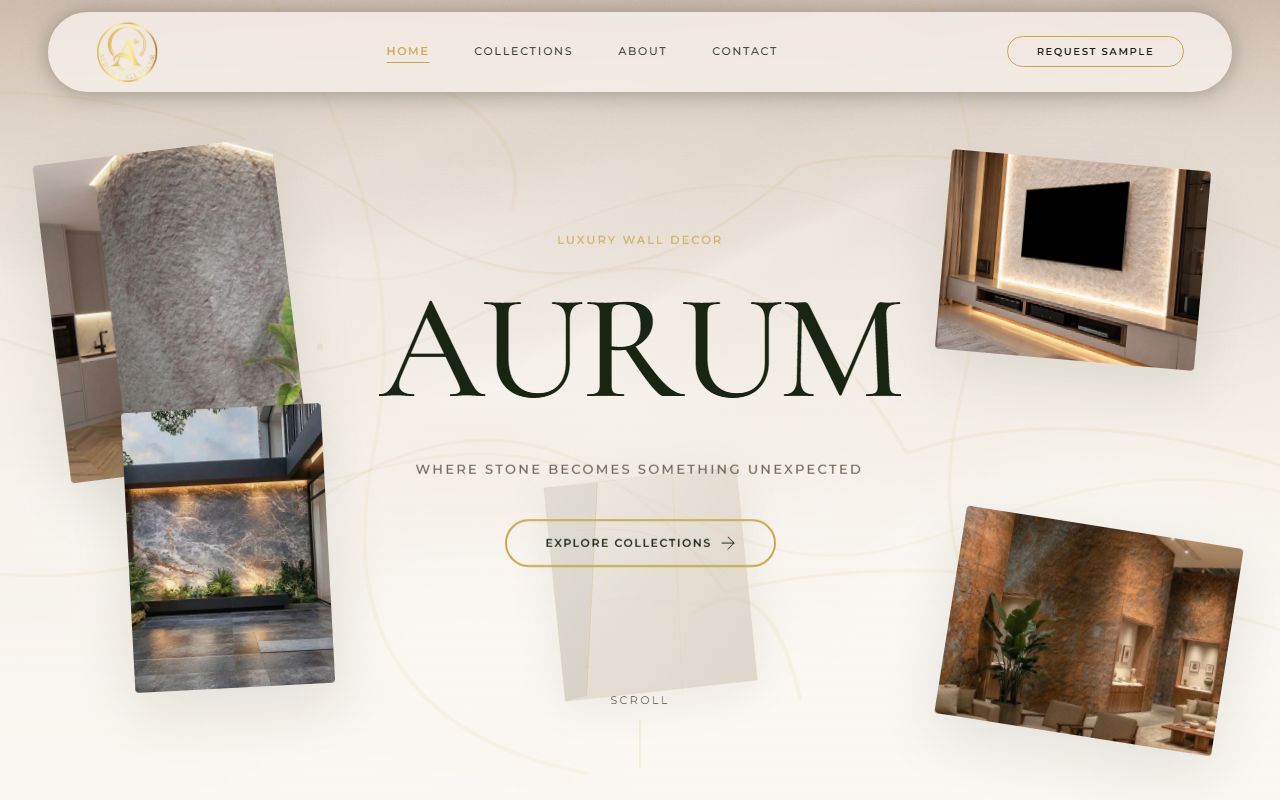
The homepage in production: the circular gold logo, Cormorant Garamond at display scale, the floating installation photography cluster, the cream background. This is what we built from a blank canvas — no template, no theme, no existing brand assets.
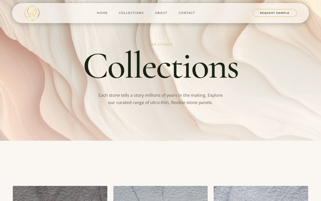
The collections page: every stone variety presented on a cream grid with macro photography. “Each stone tells a story millions of years in the making.” That line is ours.
The Numbers
| Metric | Value |
|---|---|
| Time from brief to launch | 6 weeks |
| Pages built | 4 (Home, Collections, About, Contact) |
| Stone collections presented | 17 |
| PageSpeed Mobile score | 89 |
| First Contentful Paint | Under 1.2s |
| Brand assets delivered | Logo (all formats), colour guide, typography spec, social templates |
| Form integrations | Google Apps Script + Cloudflare Turnstile |
The 89 PageSpeed mobile score with full GSAP animation and high-resolution stone photography is not accidental. WebP images with fetch priority hints on above-fold assets, lazy loading below fold, font preconnect, no render-blocking scripts, Cloudflare edge delivery. Every performance decision was made before the first component was written.
What Made This Different From a Standard Website Build
Most agencies start with a template. We started with a material.
The brief was “luxury website for luxury stone.” Before we touched a design tool, we spent time understanding what stone is — how it forms, why specific varieties look the way they do, what architects mean when they say a material “reads well at scale.” That understanding is what produced the headline “Where stone becomes something unexpected” instead of “Premium stone panels for modern interiors.”
It’s also what produced the colour palette. Off-white cream that references the material. Gold that echoes the veining in Satvario marble. Forest green that grounds everything without competing with the product photographs. These aren’t arbitrary choices — they’re derived from the material.
As a web design company in Faridabad, this is the standard we hold ourselves to: the website should understand the product it’s representing well enough that someone who visits it learns something about what makes that product worth buying. Not just what it is. Why it matters.
That’s what Aurum Wall Decor communicates from the first scroll.
Considering a Premium Website Build?
If you have a product or service that deserves better digital representation than it currently has, this is where we start.
We offer a free technical and design audit — an honest read of your current digital presence and a clear picture of what a build from scratch would realistically look like.
Request your free audit → or WhatsApp us at +91-9582818240.
No package presentation. Just an engineer’s honest assessment of what your brand actually needs.
Frequently Asked Questions
What did NodeAscend actually build for Aurum Wall Decor?
Everything from zero — complete brand identity (logo, colour system, typography guidelines, social templates), full website design and development (Astro framework, Cloudflare Pages deployment, GSAP animations, Lenis smooth scroll, Google Apps Script contact form, Cloudflare Turnstile spam protection), and all copywriting across every page. Aurum had no existing digital assets when the project began.
What technology stack does the Aurum website use?
Astro for the frontend framework, deployed on Cloudflare Pages for global edge delivery. GSAP for animations, Lenis for smooth scroll physics, Google Apps Script for form handling, Cloudflare Turnstile for CAPTCHA. Google Analytics 4 for tracking. All product images in WebP format with lazy loading and fetch priority hints for Core Web Vitals compliance.
How long did the project take?
Six weeks from brief to launch. That covered brand identity design, UI/UX wireframing, visual design, development, content writing, and performance optimisation. The timeline assumed fast decision turnaround on the client side — brand identity approvals in round four rather than dragging through ten rounds of minor tweaks.
Why did you choose Astro over WordPress or Shopify?
Aurum’s product requires a digital showroom, not a product catalogue. Shopify’s architecture is optimised for cart-and-checkout flows — unnecessary complexity for a lead-generation site. WordPress adds PHP rendering overhead and plugin bloat that hurts performance on a site where stone photography is the primary content. Astro gives us pre-rendered static pages, component-level JavaScript islands for animations, and Cloudflare edge delivery — the combination that produces sub-1.2s FCP with full GSAP animation running.
How does a website design company in Faridabad approach luxury branding?
The same way any serious design practice does — by understanding the product and the audience before opening a design tool. Luxury isn’t a visual style; it’s a set of decisions that signal expertise, restraint, and attention to what matters. For Aurum, that meant Cormorant Garamond at editorial scale, a cream background derived from the stone palette, animated reveals that feel unhurried, and copy that talks about geological formation rather than product specifications. Every decision has a reason grounded in the brand, not in a template.
Can I see the live website?
Yes — aurumwalldecor.com. It’s live, indexed, and performing.