Design People Trust in the First Three Seconds
Every design decision backed by user research, conversion data, and 10+ years of building websites that drive business results — not just portfolio pieces.
What you get, and what changes
Design work here starts with a system, not a mockup. Type scale, spacing, colour and component behaviour are settled before the first screen, which means your tenth page still looks like it was made by the same people as your first, and your team can add pages without quietly breaking the layout. Modern contrast and movement are part of that system, and they cost nothing in speed, because every animation is budgeted against the same performance target as the rest of the build. We design against real content and real devices instead of a two-column placeholder, so what you approve is what a visitor actually gets. Contrast ratios, focus states and keyboard paths are checked as we go, rather than retro-fitted after somebody complains.
Our Website Designing Services
Intuitive interfaces backed by user research
User interface and user experience design go hand in hand. A beautiful interface with confusing navigation fails just as badly as an ugly one. We design interfaces that are intuitive on first use — clear visual hierarchy, logical information architecture, accessible color schemes, and interaction patterns users already understand.
Mobile-first for 65%+ of Indian web traffic
Over 65% of web traffic in India comes from mobile devices. A website that doesn't work on mobile isn't just a bad experience — it's a business liability. We design mobile-first: every layout, navigation element, and interactive component is designed for small screens first, then enhanced for tablets and desktops.
See your website before a line of code is written
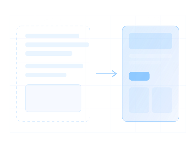
We create low-fidelity wireframes to map out page structure and user flows, then build interactive prototypes in Figma that you can click through like a real website. This lets you test navigation, validate content hierarchy, and make changes when they cost nothing.
Your brand, not a template marketplace
We develop cohesive visual design systems: color palettes that convey your brand personality, typography that's both beautiful and readable, icon systems, image styles, and component libraries. For businesses without established branding, we create brand identity from scratch.
One job: convert
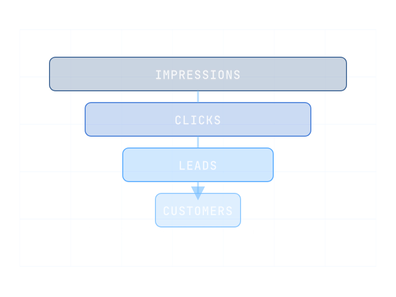
We design high-conversion landing pages for ad campaigns, product launches, event registrations, and lead generation. Clear value propositions above the fold, compelling CTAs, trust signals, social proof placement, and mobile-optimized forms — all A/B tested and optimized based on conversion data.
WCAG 2.1 AA — design for everyone
Accessibility is built into our design from day one. Proper color contrast, keyboard navigation, screen reader compatibility, and semantic structure. Accessible design reaches more users and improves SEO — it's not an add-on, it's a standard.
UI/UX Design
Intuitive interfaces backed by user research
User interface and user experience design go hand in hand. A beautiful interface with confusing navigation fails just as badly as an ugly one. We design interfaces that are intuitive on first use — clear visual hierarchy, logical information architecture, accessible color schemes, and interaction patterns users already understand.
Responsive Web Design
Mobile-first for 65%+ of Indian web traffic
Over 65% of web traffic in India comes from mobile devices. A website that doesn't work on mobile isn't just a bad experience — it's a business liability. We design mobile-first: every layout, navigation element, and interactive component is designed for small screens first, then enhanced for tablets and desktops.
Wireframing & Prototyping
See your website before a line of code is written
We create low-fidelity wireframes to map out page structure and user flows, then build interactive prototypes in Figma that you can click through like a real website. This lets you test navigation, validate content hierarchy, and make changes when they cost nothing.
Brand Identity & Visual Design
Your brand, not a template marketplace
We develop cohesive visual design systems: color palettes that convey your brand personality, typography that's both beautiful and readable, icon systems, image styles, and component libraries. For businesses without established branding, we create brand identity from scratch.
Landing Page Design
One job: convert
We design high-conversion landing pages for ad campaigns, product launches, event registrations, and lead generation. Clear value propositions above the fold, compelling CTAs, trust signals, social proof placement, and mobile-optimized forms — all A/B tested and optimized based on conversion data.
Accessibility Design
WCAG 2.1 AA — design for everyone
Accessibility is built into our design from day one. Proper color contrast, keyboard navigation, screen reader compatibility, and semantic structure. Accessible design reaches more users and improves SEO — it's not an add-on, it's a standard.
Website Designs That Rank and Convert
SEO-optimized layouts
Proper heading hierarchy, structured data, and strategic content placement built into every design — not retrofitted after development.
Performance-conscious design
We design with page speed in mind. Optimized image formats, minimal custom fonts, efficient layouts that render fast on 3G networks.
Accessibility-first
WCAG 2.1 AA compliance — proper color contrast, keyboard navigation, screen reader compatibility, and semantic structure.
Conversion-focused
Every page has clear goals. CTAs are prominent, forms are short, trust elements are strategically placed, and user paths to conversion are frictionless.
Design system approach
Consistent components, spacing, and visual language across every page. Scalable design that stays cohesive as your website grows.
Design + development, one roof
Unlike standalone design agencies, we build what we design. No 'lost in translation' between designers and developers — pixel-perfect implementation guaranteed.
Where cheap design gets expensive
Design decisions are rarely wrong on the day they are made. They become expensive later, when the site has to rank, convert, or be edited by someone who was not there. The pattern is consistent enough to be worth writing down.
| The shortcut | Why it is tempting | What it costs later |
|---|---|---|
| Text baked into images | Total typographic control, fast to produce | Invisible to search, unreadable to screen readers, retouched for every edit |
| A full-screen hero image on every page | Looks impressive in the mockup | Largest Contentful Paint suffers on exactly the pages meant to convert |
| Light grey body text | Feels refined on a designer's monitor | Fails contrast, and is genuinely hard to read outdoors on a phone |
| Custom scroll and cursor effects | Differentiation | Interaction cost, motion-sickness complaints, and fragility on mid-range Android |
| Layouts only the designer can edit | Pixel-perfect launch | Every small change becomes a paid ticket |
Designing for the page that has to rank
A commercial page has jobs beyond looking good: it needs a single clear heading structure, text a crawler can read, and a visible answer to the question the visitor arrived with. Those constraints are not opposed to good design — they mostly rule out decisions that were weak anyway. Where they genuinely conflict, we say which one we are trading and why, rather than silently choosing the prettier option.
We design mobile first because that is where most Indian traffic is, and because a layout that survives a narrow screen almost always widens gracefully. The reverse is not true.
Accessibility as a design constraint, not a retrofit
Colour contrast, focus states, target sizes and a sensible reading order cost nothing when decided in the design and are painful to add afterwards. They also overlap almost entirely with plain usability: bigger tap targets and readable text help everyone holding a phone in bright sunlight, not only people using assistive technology.
We check contrast against WCAG 2.2 AA while choosing the palette rather than after the build, which is the difference between a colour system that works and one that has to be quietly adjusted post-launch. Implementation sits on website development, and the brand layer on digital marketing.
How We Work
Week 0
We work out who actually buys from you and what makes them hesitate. Design decisions get much easier once that is written down.
Week 1
The system before the screens: type scale, spacing, colour, states, and how each component behaves. This is what keeps page ten consistent with page one.
Weeks 2-3
Key screens designed against your real content, on the devices your visitors really use. Not a two-column placeholder full of lorem ipsum.
Review
You see it as a clickable prototype rather than a flat image. Movement and contrast get checked against the performance budget at this point, not after.
Handoff
Components, tokens and states go to whoever builds it, with the accessibility rules written down instead of assumed.
After
The system is yours. Your team adds pages that still look designed, which is the whole reason for building it this way.
Tools We Use
Key Takeaways
Quick summary — everything you need to know about our Website Designing service
- Website design projects are scoped by depth and deliverables — UI/UX mockups, wireframes, responsive states, and design systems are estimated after reviewing page count and complexity.
- Every design is mobile-first and WCAG-accessible — we design for smartphones first, then scale up. Accessibility compliance is standard, not an add-on.
- We build complete design systems — not just page mockups but reusable component libraries, style guides, and design tokens your team can maintain long-term.
- Design process: Discovery → Wireframes → Visual Design → Prototype → Developer Handoff. Every stage is collaborative with client sign-off before proceeding.
- Free design critique available — we review your existing website and identify UX problems, conversion blockers, and design inconsistencies at no charge.
Common Questions
What's your website design process?
We start with comprehensive research: user interviews, competitor analysis, and market insights. We develop detailed user personas, create wireframes, and prototype designs with real users. Our process is iterative—we refine based on feedback before development begins.
How do you balance design aesthetics with performance?
Beautiful designs that load slowly fail. We optimize everything: purposeful imagery, fast-loading fonts, efficient layouts, and clean code. Performance and design aren't opposing forces—every design decision considers both visual impact and technical efficiency.
Do you design for mobile-first responsiveness?
Absolutely. Mobile-first design is foundational to everything we create. We design for smaller screens first, then enhance for larger ones. We test on real devices, ensure larger touch targets, use readable fonts, and optimize navigation.
Can you redesign our existing website?
Yes. We analyze current performance, identify pain points, track conversion issues, and propose strategic improvements. We preserve what works and enhance what doesn't. Smart redesigns improve engagement, conversions, and user satisfaction.
How do you ensure accessibility in website design?
Accessibility is built into our design from day one. We follow WCAG guidelines, ensure proper color contrast, use readable typography, implement keyboard navigation, and use semantic HTML. Accessible design benefits everyone.